Tactile Wireframes
Designing for accessibility with accessibility in mind
A story of how three designers created a shared language with our Development Manager who lives with a vision impairment. We created a kit that allows designers to build physical wireframes to communicate designs through the sense of touch. Using our tactile wireframes, our dev manager could be part of the early conversations on feasibility and accessibility, something that he previously only was able to do after designs had been built.
Introduction
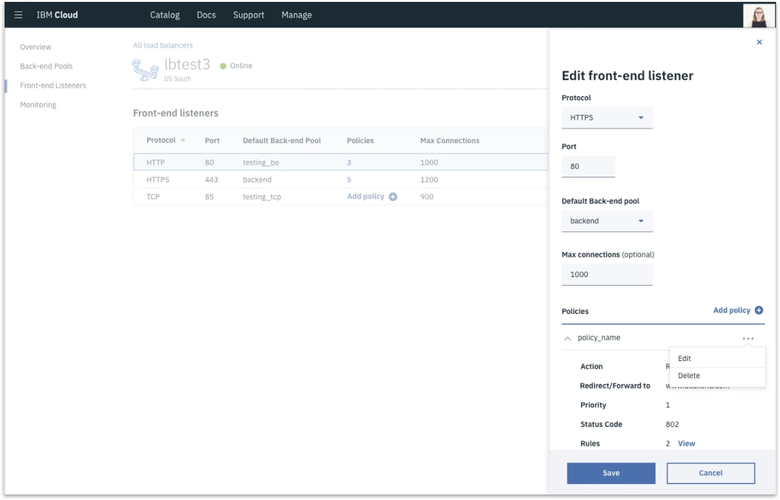
We design for IBM Cloud services that require complex data tables.
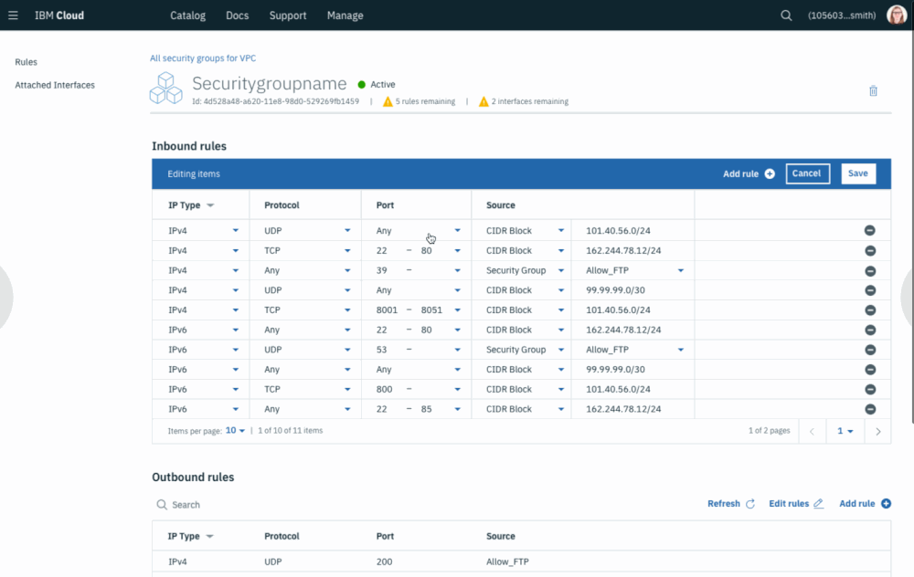
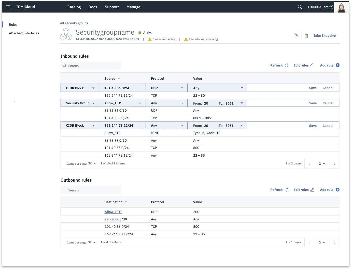
Take a look at this data table we’re working on. If you think this is complex now, imagine what it’s like to navigate this table with a vision impairment, where your only cues for what is happening are given through sound.
Working with our developer manager, we learned that people with vision impairments use screen readers to engage with websites and applications. To empathize a little further on what that experience is like, here’s an example of the same Slack conversation with and without a screen reader.
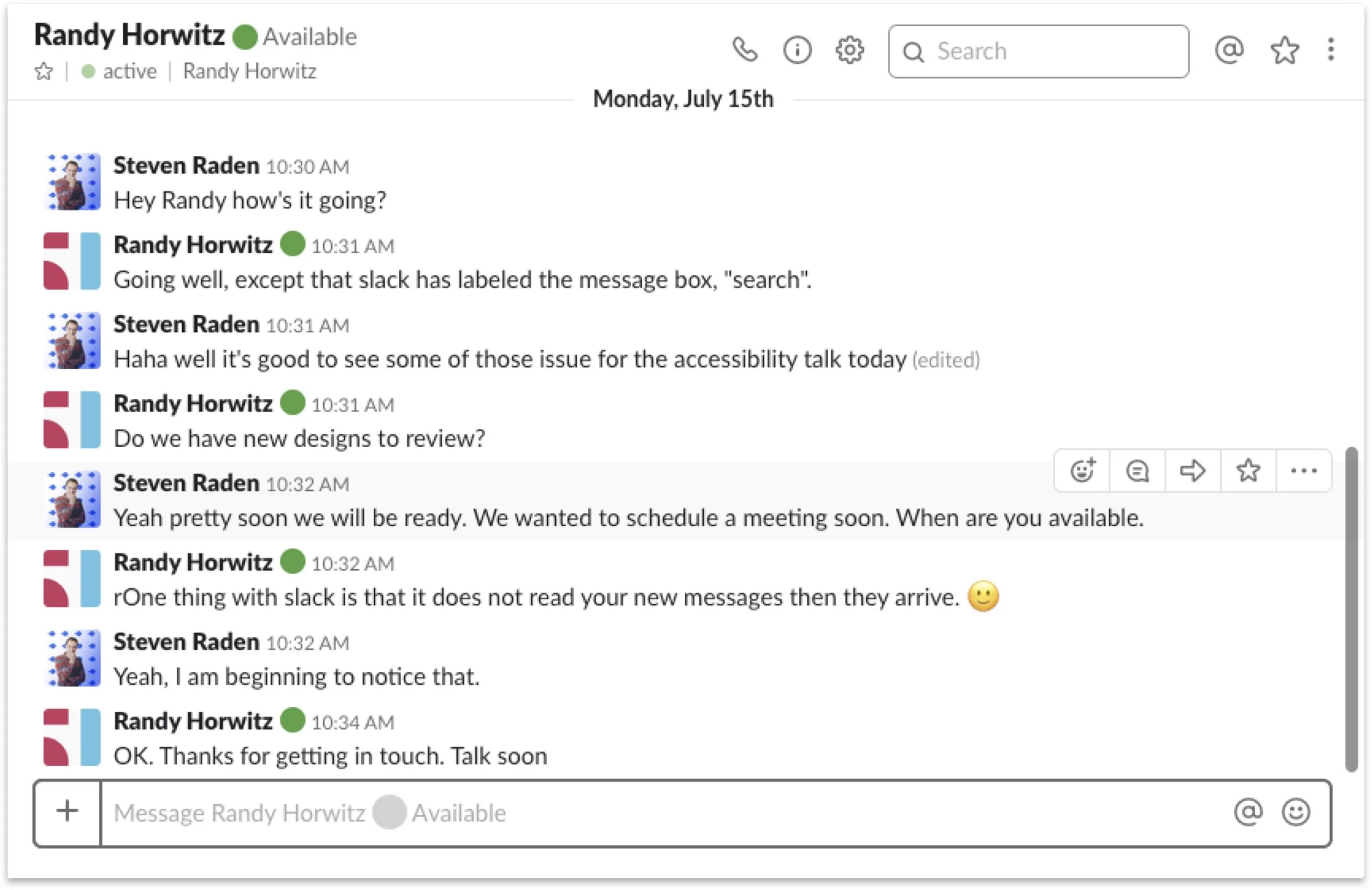
Slack conversation for someone without a visual impairment
Slack conversation for someone with a visual impairment
Now imagine how difficult It would be to interact with our complex tables when you only have auditory cues for guidance.
When Randy used screen readers to evaluate our designs that had been built, he identified some serious accessibility issues.
Our team didn’t really realize those things until this table was coded, allowing him to interact with it using a screen reader. Today, users with visual impairments can only provide feedback with a developed application that is compatible with a screen reader. By that time, many changes would require extensive code refactoring, which would increase company expenses and delay improvements.
So, by the time Randy interacted with this table, a lot of costs had already been made from the team.
Problem statement
How can we better incorporate accessibility into the design process so we can enable teammates with visual impairments to provide actionable feedback earlier in the process?
Personas
-

Martin, Developer Manager
Manages a team of developers for CloudLand, a cloud computing company.
Lives with vision impairment and is assisted by a guide dog.
Uses screen readers to give feedback to devs and design teams. Advocates for accessibility.
-
Desi, Designer
UX designer at CloudLand.
Creates wireframes and Invision prototypes to explain interactions to her development teams.
Prototypes are tested on a variety of participants, but generally limited to point-and-click interactions.
-

Tonya, Developer
Front-end developer at CloudLand.
Iterates with Desi and the design team to create coded, production level, experiences.
Primary concerns are around a release being functional and accurate to designs.
Painpoints
Martin cannot give feedback until later stages of development, meaning his input often goes unaddressed.
Desi cannot get Martin’s feedback on accessibility because her designs must be coded before he can use a screen reader to evaluate them.
Developers have to spend significant time refactoring designs to account for accessibility issues.
Research
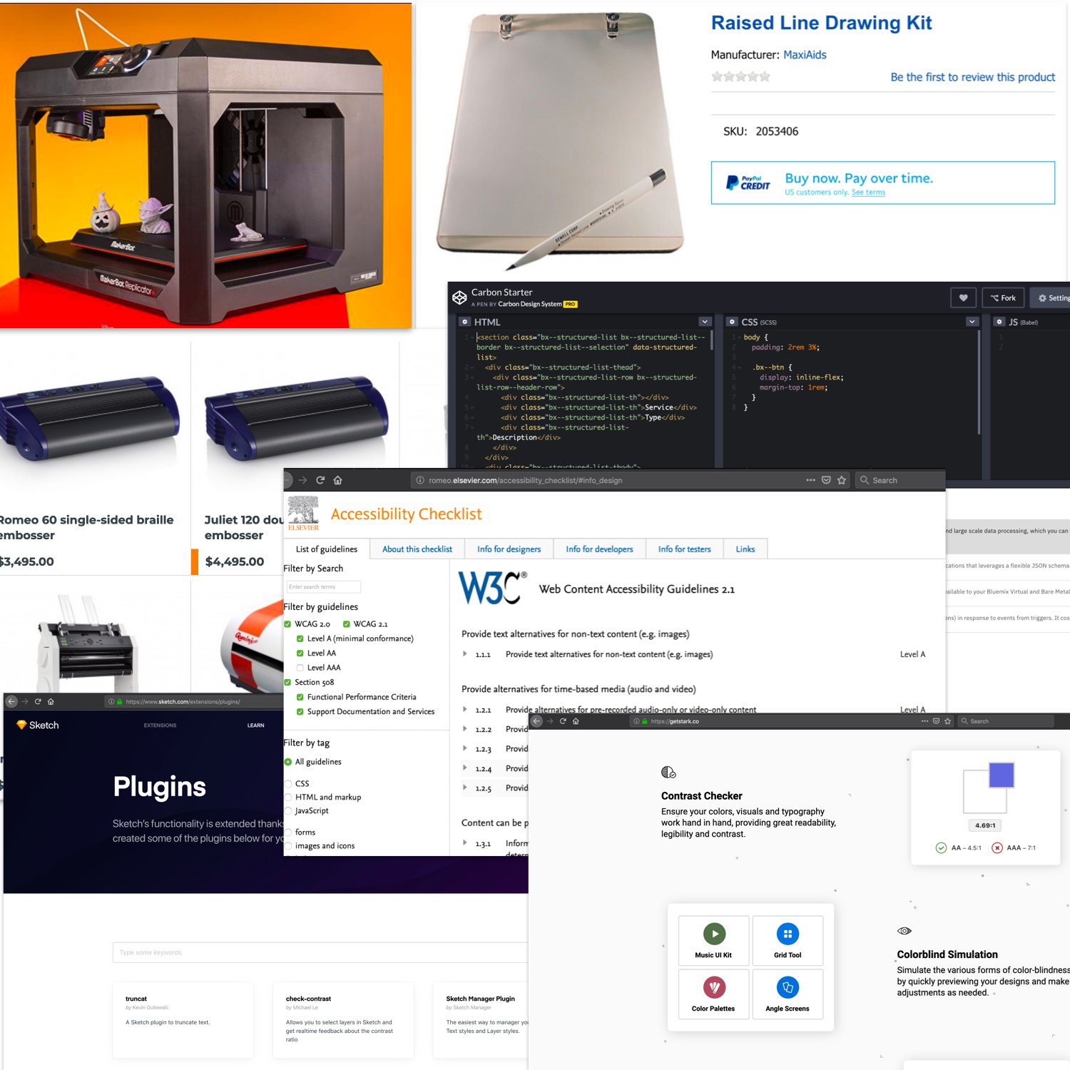
We explored the space to see other tools that existed to help share in progress designs to those with visual impairments. Our major findings included:
Developed prototypes - requires a good amount of time and technical skills to build, not something that can be iterated quickly
Accessibility plugins for Sketch and other design tools: limited to communicating accessibility on color contrast and text sizes
Accessibility guidelines and checklists: unable to communicate static designs to those with visual impairments
3D printers / embossers: allows for tactile feel of a physical object but has high cost for machinery and high cost in time to build
Raised line drawing kit: great for details with micro interactions but difficult for a macro view of reading layouts and flows
From our research, we recognized that we would be able to move best with a physical medium. We needed something that was inexpensive, fast to iterate with, and easy for someone with visual impairments to interact with.
Our goal was to enable users to iterate quickly in a tactile, accessible medium.
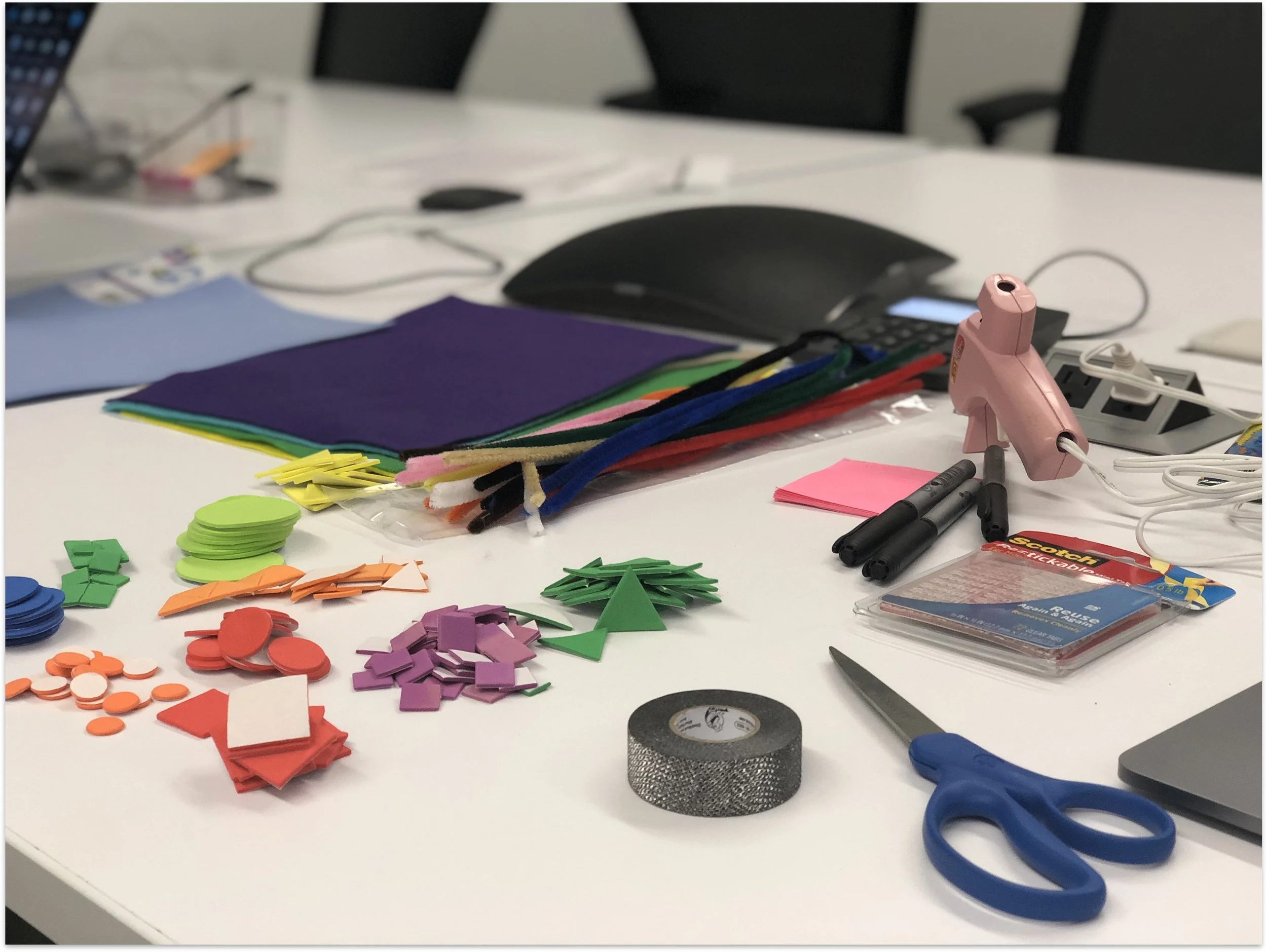
Phase 1: material exploration
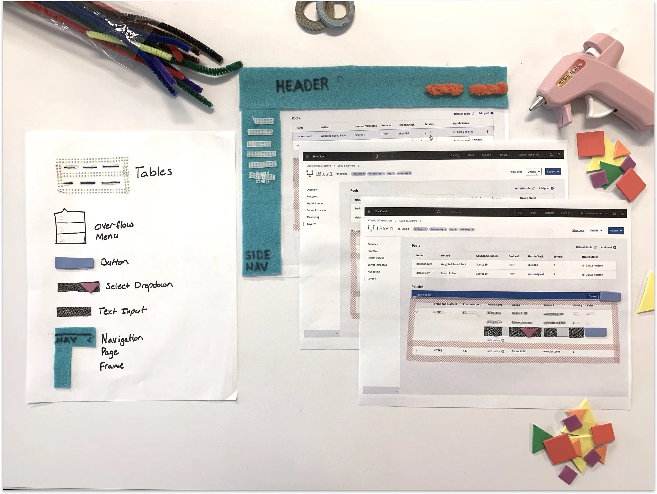
With a tactile medium, we began with a material exploration. We focused on gathering a variety of different materials: glue, textured tape, pipe cleaners, and felt pads in different shapes. Using the materials, we put together wireframes and tested them out on Randy to see what textures worked.
Utilizing the raised line drawing kit
We also worked with the raised line drawing kit to see how Randy liked it compared to actual physical shapes and materials. We found that the raised line kit was easier for drawing really detailed micro interactions and the shapes and textures were better for communicating a macro view of layout and flows.

Our takeaways from this round were:
Foam shapes, hot glue, felt, and textured tape were really easy to work with and we could iterate with them quickly. They helped communicate interactions on a larger scale.
The raised line drawing pad was good for drawing micro details and interactions.
Our next steps was to use the materials to create a pattern library.
Phase 2: creating a pattern library
The result of phase 1 left us with many diverging tactile patterns. The next step for us was to converge our designs and create a common language and understanding.

Carbon Design System
Building off of Carbon Design System
This brought us to Carbon, the design system that we use at IBM. We weren’t looking to reinvent a design system but instead build off of one that was already successful within our teams. Think of Carbon as our digital design system, and us looking to build on top of Carbon with a tactile design system.
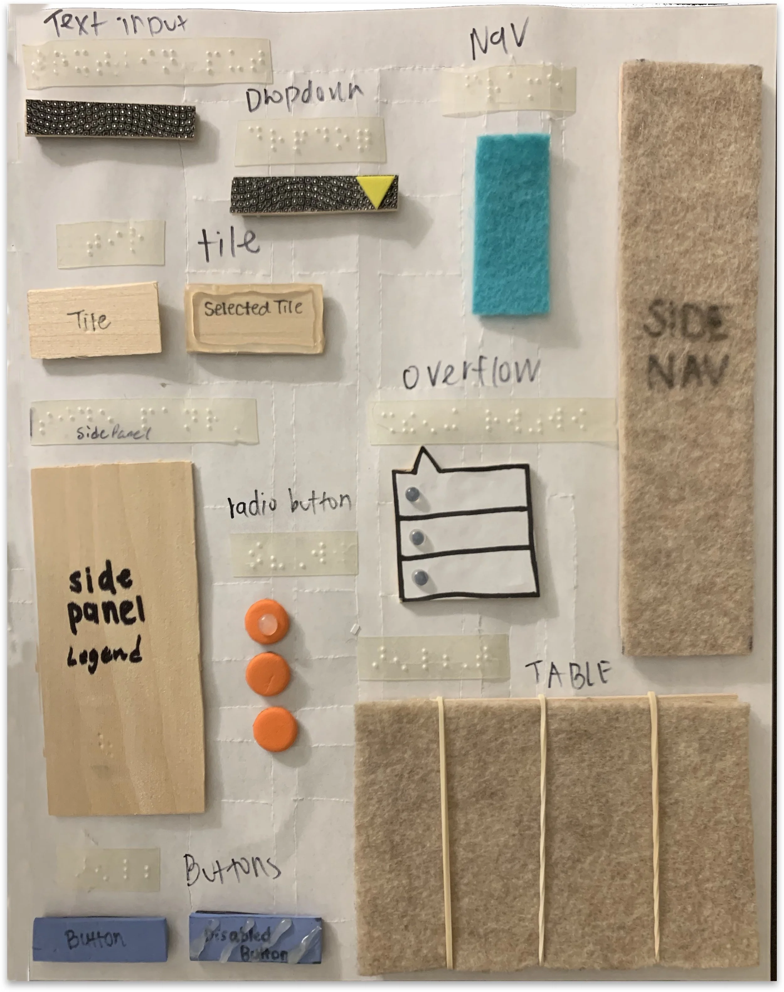
Utilizing Carbon’s design system, it led to our next steps of creating our own shared vocabulary of common tactile components and tactile guidelines.
The start to a tactile design system
We aligned on patterns based off what was successful from testing on Randy and created a legend to help organize and represent our tactile pattern library. This first iteration of our legend guided us to keep consistency amongst our designs while putting together full tactile wireframe pages.
We tried keeping similar materials for similar components: such as having the same textured tape for a dropdown and a text input.
And we used different textured materials for unrelated components: such as felt for a navigation to contrast textured tape for the inputs.
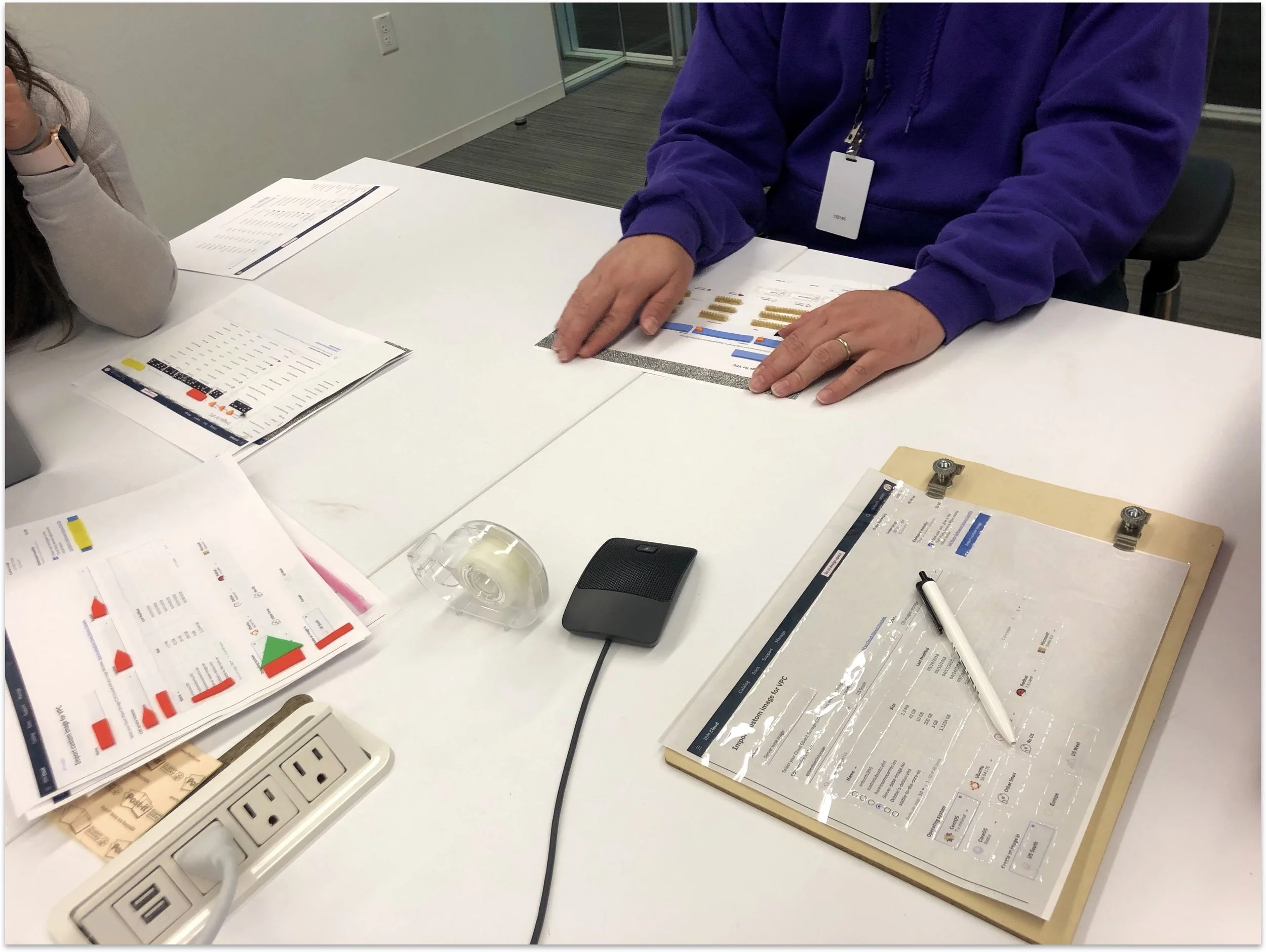
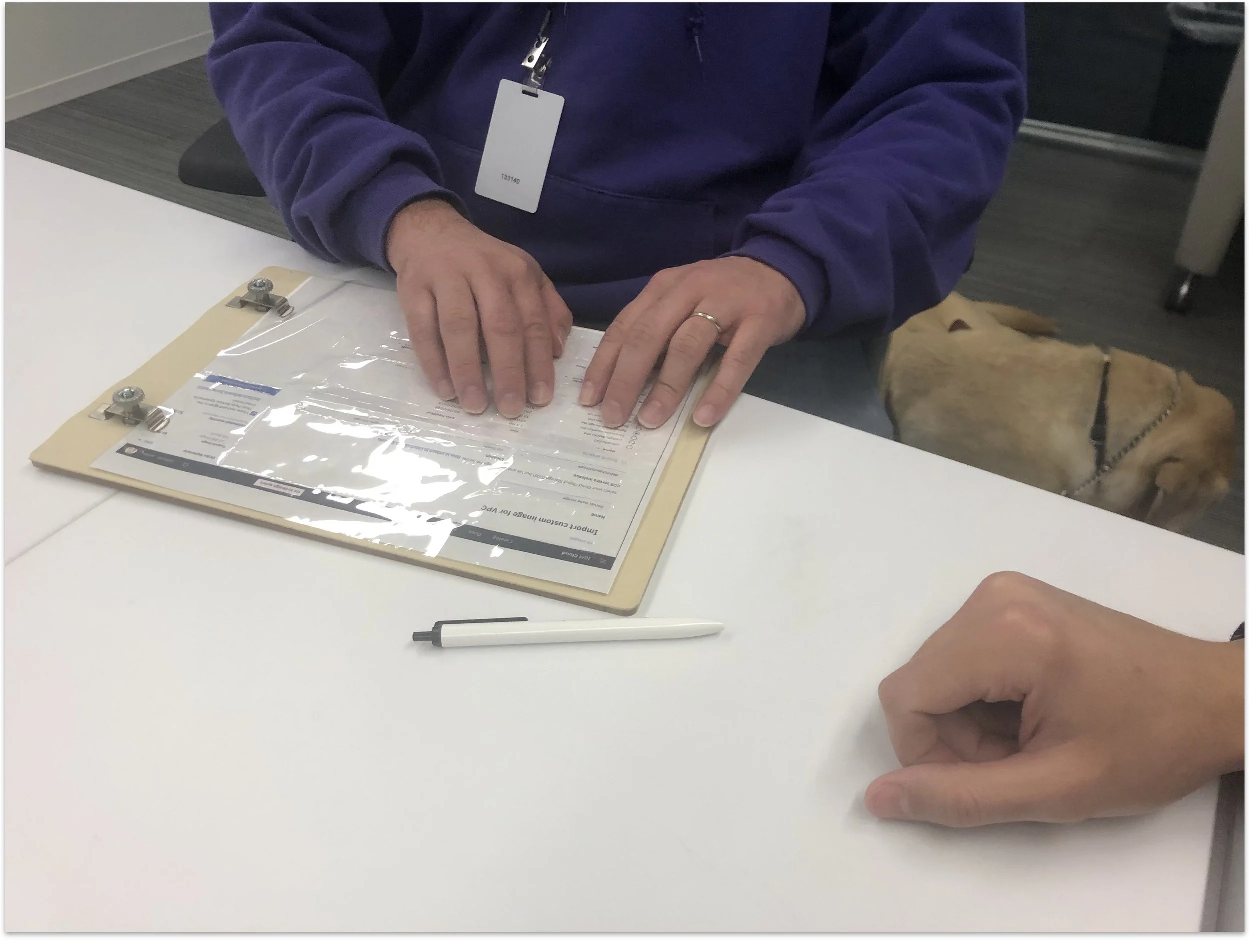
Putting it to the test
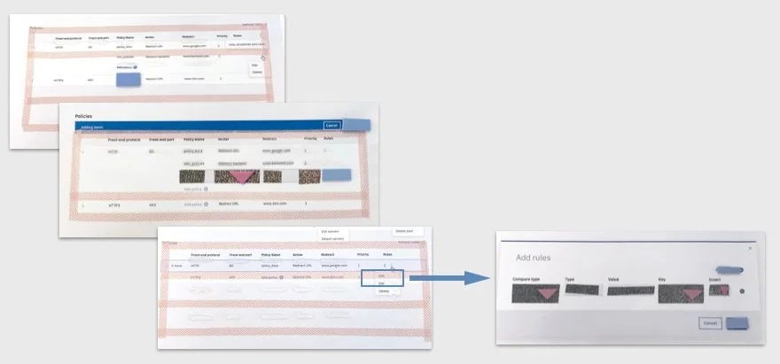
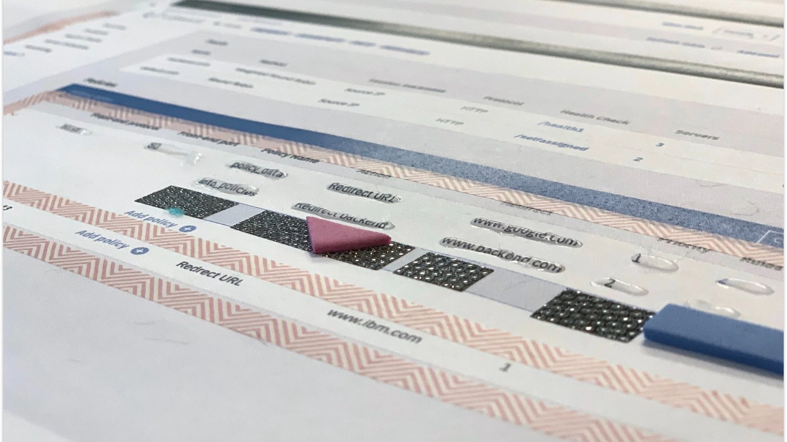
Therefore, forming a tactile component for our tables really put to test our pattern library while we needed to figure out ways to keep tactile patterns consistent but distinct.
We tested the pattern library with Randy to see how he identified the components amongst each other. While he ran his fingers over the tactile prototype, we communicated the components and pattern library to him verbally as he went along with providing any additional details about the designs.
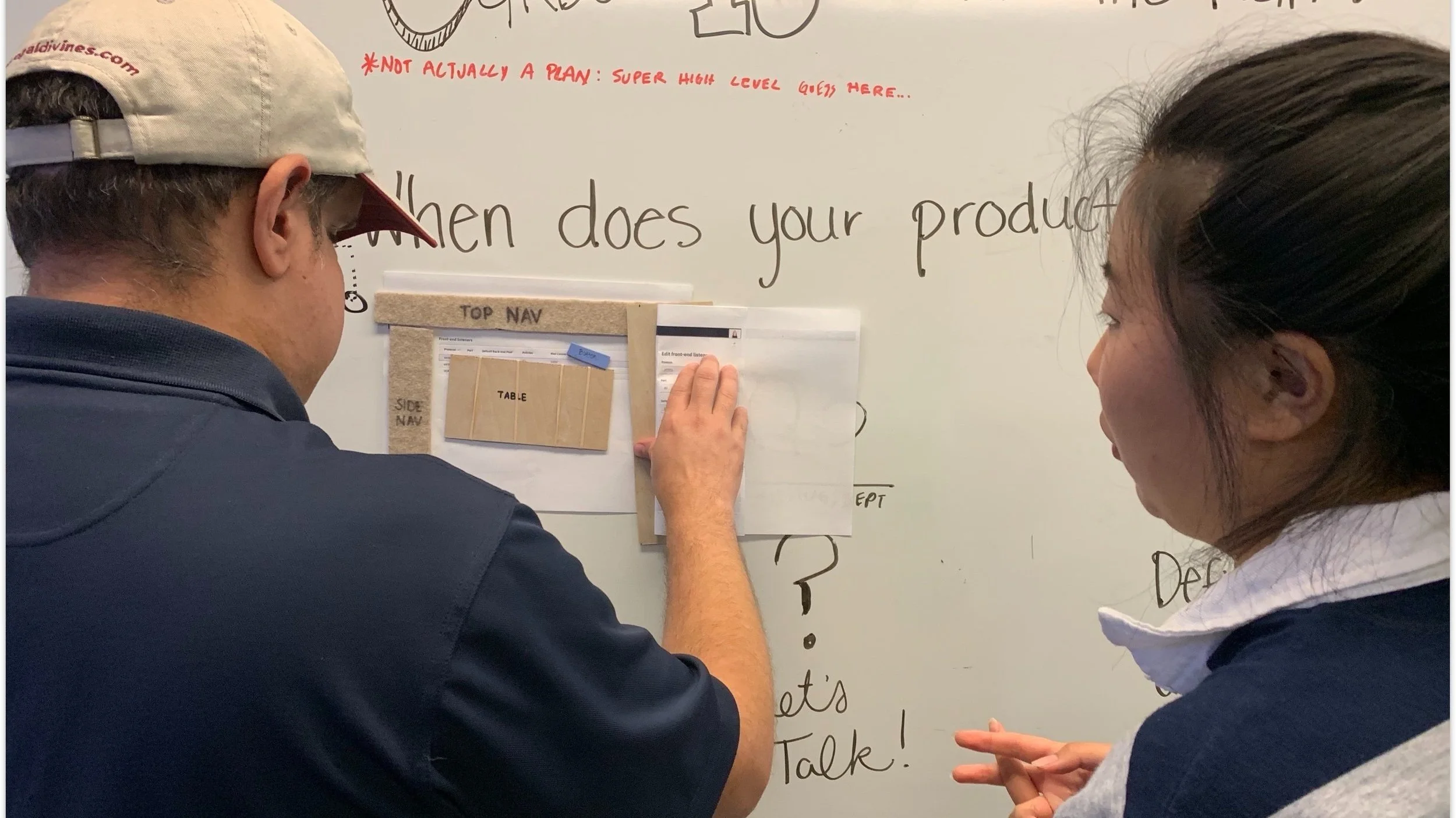
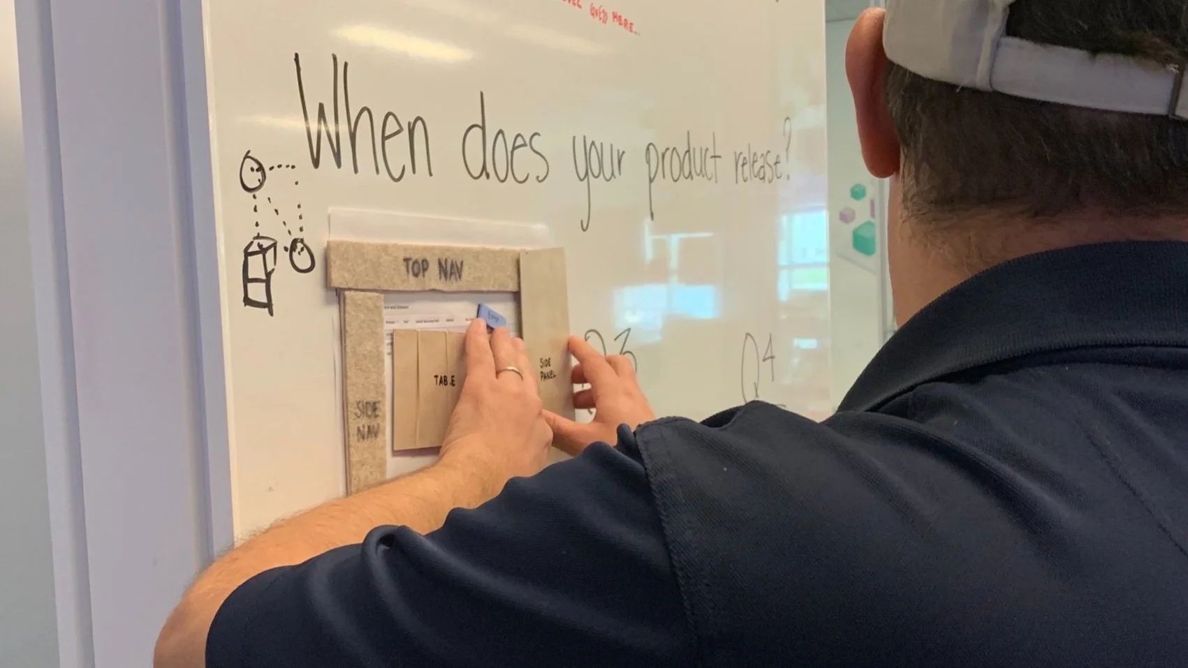
Applying our tactile pattern library to our complex designs
Going back to our tables within our Infrastructure products we had to account for all of its complexities when applying our pattern library. Our tables needed to account for multiple actions of add, edit, and delete; while also needing to scale for cascading actions. Additionally, our tables can have the same action for different patterns such as adding a new item within a modal and adding inline within the table.

Our takeaways from this round were:
The pattern library made it easier for us to quickly create components and created consistency across our designs
The consistency simultaneously helped Randy’s ability to better understand the designs.
Our next steps was to 1) scale the kit to be reusable and 2) apply the updated kit to test out our WIP designs with the development team.
Phase 3: scaling the kit
In this phase we focused on finding a way to make our kit scalable such that it could be easily put together with low cost in time and money. To be scalable, it needed to be reusable rather than gluing the pieces together and discarding after each usage.
Making the kit reusable
We experimented with materials that we could use in place of glue and tape. Velcro was great at being reusable but it introduced a new texture for a blank canvas. We didn’t want to introduce a new texture and needed a neutral base surface that wouldn’t over power the existing textures.
That pushed us to experimenting with a whiteboard as the neutral surface. We had easy access to whiteboards in the office and we could use magnets as the connecting material. We used bass wood as the structure of the component due to it being thin, lightweight, and sturdy.
Using these new materials with the textures from our previous rounds, we recreated all of the components to build out our kit.


The final kit
And here’s what our kit mostly looks like today. It has everything needed to build full page designs and open to adding further patterns to the kit.

Phase 4: the kit in action!
We put our newest kit to the test on our complex tables.
At the time, our design team had been iterating through a new side panel component to replace our data tables inline editing since it was not accessible. Since this was a new pattern we were introducing, we thought it was the perfect opportunity to put our kit to the test.
In the room, we had developers that were both sighted and with visual impairments providing feedback to Michelle’s latest Load Balance designs. Michelle had her digital designs projected to the screen for our sight seeing developers while she used the tactile kit for Randy. Using the kit, Michelle built out her tactile designs on the spot for Randy and walked through her designs for the entire development team. This took less than a minute of additional effort to build out tactile designs along her digital designs.
The results
Randy was really excited to be able to follow along with the designs and discussion with the rest of the team. He understood the layout of the designs and the interactions that we were testing. By being able to understand what was being shared, he was in turn able to provide valuable feedback.
This was our goal from day 1. We wanted to make sure that we could get Randy’s feedback early in the process so we could address it. Without using this kit, we’d lose out on hearing Randy’s feedback. The designs would be built by our devs and only then would Randy being to provide comments. At that point, the team would have to go back and redo the work.
Randy’s feedback
So what was some of the actionable feedback that Randy was able to provide?
Add breadcrumbs to help with way-finding.
Incorporate table info on side panel since it hides content on the page.
Work through delete interaction for a policy in the table.
Using this feedback, we were able to quickly reiterate before building the designs.

Impact
We continued to scale this kit beyond our design team allowing other teams within our design organization to communicate with teammates that have visual impairments. We also had the opportunity to share this work to a wider audience outside of our company amongst designers and accessibility advocates when we spoke at Big Design in Dallas, TX and A11y Camp in Sydney, Australia. We received feedback from attendees that they were inspired to take this back to their teams and design for accessibility with accessibility in mind.

Creators: Janelle Arita, Steven Raden, Jenny Lanier