IBM Cloud
Making it easier to discover and buy IBM Cloud services
Following one of the largest mergers within the cloud computing world, SoftLayer and IBM Bluemix, it left the massive challenge to reimagine the IBM Cloud platform into one cohesive experience. This challenge was left to an all encompassing team of designers, engineers, and product managers assigned to this historic project to redefine IBM Cloud - ultimately affecting 157 app teams (over 600 people).
My role served as design lead to create a unified experience for the discover, try, and buy experience for IBM Cloud users. I led my team through the phases of understanding market trends, competitive analysis, qualitative feedback, and user research with current customers. Myself, along with Maria Burke, and Pat Ree, drove the effort in the discovery, user testing, design and delivery of an improved discover, try, and buy experience for IBM Cloud Services.
Setting our roadmap
I led the Discover and Buy squad design team which was one of 6 squads that each tackled a key milestone of the user journey. Our squads worked in succession over 6 months from kickstart, discovery, solution, and implementation phases to hit our deliver together. Within my squad of 14 that consisted of engineers, product managers, and designers, we worked together from the kickoff to deliver on every asset that led up to a hills playback, playback zero, and release launch. Through weekly design reviews, bi-weekly cross squad syncs, and daily stand-ups, I led the designers within my squad through extreme deadlines, technical constraints, and pivots which ultimately delivered results for our team to be proud of.


Understanding the as-is experience
Mapping out the as-is end to end flow
The squad leads kickstarted the project by identifying the as-is experience of the end to end flow. Through workshopping design thinking activities, we identified our personas, the milestones, and the user pain points and needs.

Narrowing in on the discover, try, and buy as-is experience
Within my squad, we evaluated the as-is discover, try, and buy experience for each of the 170+ cloud service offerings. This entailed identifying the entry points from marketing to discovery through the catalog to trying out the service with the pricing calculator and to purchasing the service. We distilled the purchasing experiences into 11 common patterns. Identifying the themes and individual experiences of all offerings, we formulated the top pain points to address:
Identified as-is pain points
Duplicated efforts due to 2 platforms and numerous variations of provisioning pages
Indirect entry points to provisioning from marketing
Inconsistent catalog categories and terminology between marketing, documentation, and product
Inability to fully try out experience due to upgrade paywall or restrictions

Identifying common page layouts within the as-is discover, try, buy user flow

As-is IA
The problem

We further broke this down into 3 main problems to address:
Discover: users were unable to find and understand IBM Cloud offerings
Try: users were unable to estimate costs for IBM Cloud offerings
Buy: users were unable to configure and purchase an IBM Cloud offering
Personas

Todd, Operations Admin
Find cloud solution he trusts to have his enterprise data to remain secure
Consistently provide infrastructure and application development tools to development teams
Efficiently manage critical applications

Jane, Lead Enterprise Developer
Create secure apps that can leverage public cloud services and APIs
Create cloud native applications and microservices
Modernizing legacy applications
Hills
From identifying the pain points and personas, we wrote out our top 3 hills to work towards as a squad and broke out the epics, user problem, user stories, success metric, and it’s dependencies.


Workshopping an integrated buying experience
One of the major pain points to tackles was how to create an integrated buying experience for new and existing users. We narrowed in on the authenticated and unauthenticated user flow to focus on how that would affect an integrated buying experience with things like viewing costs when not logged into an account.
Aligning on user needs

Mapping out the to-be experience

Prioritizing big ideas and breaking down roadmap

Design iterations and testing
Transformation of our provisioning page template
We looked to utilize the success of our new Virtual Server provisioning pages as the layout template to align to. Previous to the start of this project, I had focused on improving our legacy Virtual Server provisioning pages within SoftLayer portal to our newer provisioning page that lives within IBM Cloud portal. From the 17 weeks that it had been live, the new provisioning page had a significant and steady up-tick conversion of a 387% increase.

Based on the success in data with the new Virtual Server provisioning page, we looked at scaling the new designs to apply to our other 170+ provisioning pages and iterated to a general template.

Pricing calculator
From workshopping an integrated buying experience, we identified that users needed a way to easily see resources that are part of a single solution as well as estimate the cost of any product. Users also needed a way to compare different configurations, pricing plan/options. This led to our explorations of a pricing calculator.

Modal vs side panel interaction
Another painpoint that we still faced with the new layout was needing a way to add or modify a resource at scale. We iterated through designs and ended up with two main component interactions: modal or side panel. We conducted an unmoderated usability test with 6 participants to evaluate the usability of interacting with a side panel to add or modify a resource.

Modal vs side panel interaction user test results
Overall, the side panel behaved as participants expected with a few additional takeaways:
Participants understood iconography and using color aided in communicating affordances on the page.
Participants were familiar with notifications confirming a change has been made.
Participants looked for required fields to have an ‘*’ and non required fields to say “(optional).”
Participants did not notice the price change but looked for a cost summary after making all their inputs.

User test evaluation
Deliverables
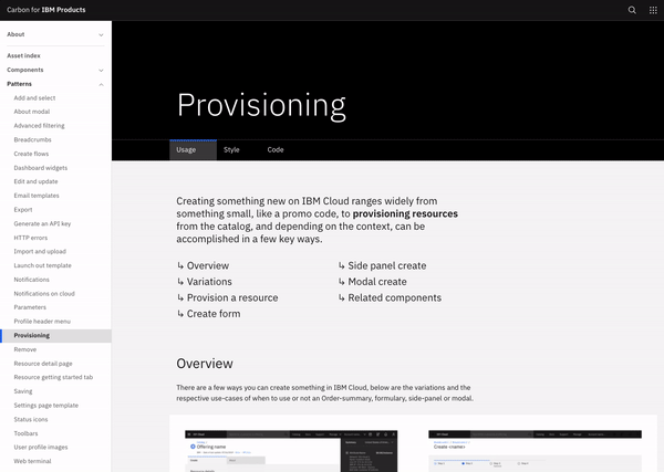
We created guidelines that served as a source of truth for all of IBM Cloud product teams. The guidelines covered usage around content, layout, development component, and type and spacing hierarchy. Building off of Carbon’s design system patterns, we further defined usage around Carbon patterns to keep alignment across our provisioning pages as teams migrated over to a unified IBM Cloud.
Check out the full Invision prototype here.

An integrated discovery, try, and buy user journey

Impact
Our work on the discover, try, and buy squad led to a set of standards for the 170+ service provider teams to use for their offerings. Our guidelines were then adopted into Carbon, IBM’s design system as a provisioning pattern to be used across the company.
See it on IBM’s design system here.
Additionally, our success shined through in creating a unified discover, try, and buy experience as the number of unified accounts increased from an initial 35 to 400+ accounts within the first week of release.